HD Hero 2 & Hero 3
Game-changing action adventure cameras

Game-changing action adventure cameras
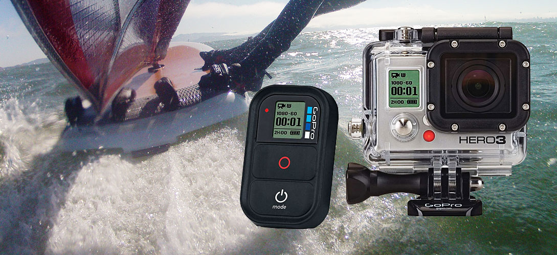
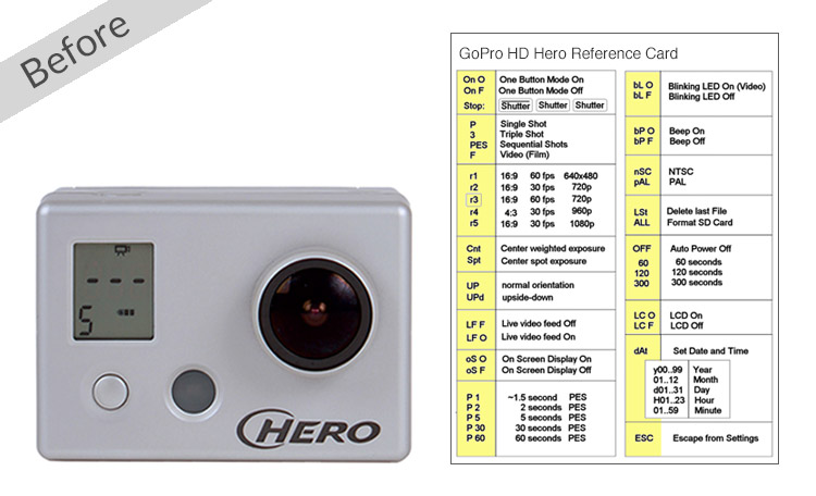
GoPro’s HD Hero video camera was a bestseller for many reasons, but its segmented LCD UI was almost unusable. For the HD Hero2 and Hero3, Swim was tasked with designing the best UI possible within these challenging constraints:
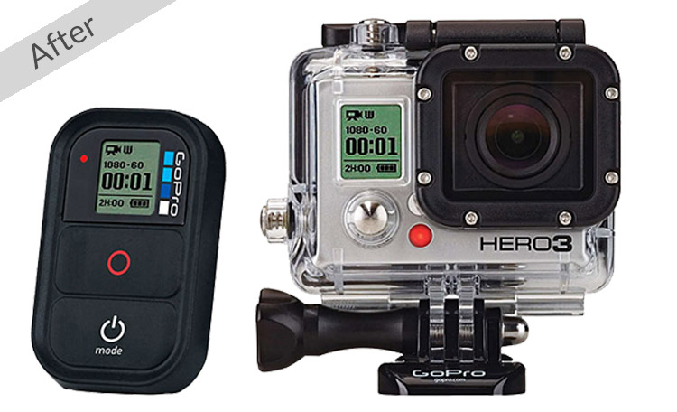
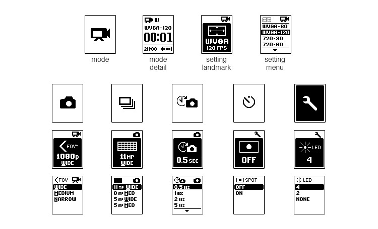
We completely overhauled the UI, devising a new framework that is readable, extensible, and intuitively controlled by only two buttons. We created a rich visual language consisting of four distinct screen types that fully utilized the new bitmap display. This included developing custom iconography and typography at several scales.
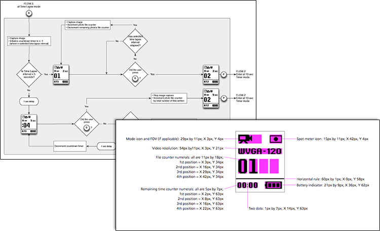
To ensure successful transfer of the design, we provided the development team with behavioral flows, screen graphics, and layout specs. Swim was also responsible for extending the UI framework to support the WiFi BacPac and three versions of the Hero3 camera. The UI framework Swim devised continued to support subsequent cameras, having a life well beyond the initial project.
“MUCH easier to navigate through…without ever looking at the user manual"
The new interface was praised by reviewers and users as “MUCH easier to navigate through” and “[usable] without ever looking at the user manual”. Alongside everything else the Hero cameras offer, the new interface contributed to GoPro’s phenomenal success.
